Branding & Identity
learn more

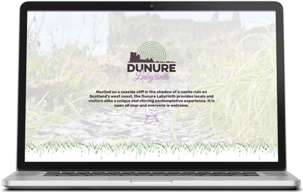
We established a brand expression and launched a microsite for Dunure Labyrinth for the surrounding community to provide visitors with directions and a little bit of history.
We took inspiration from the area surrounding the labyrinth itself. The brown represents the castle ruins, green for the vegetation, and purple for the crushed slate. The ruins of Dunure Castle is instantly recognisable so we felt it was important to include it as a silhouette. Positioning the seven-circuit classical labyrinth design at the centre of the branding also felt like the right choice.
We are absolutley thrilled at how this turned out!
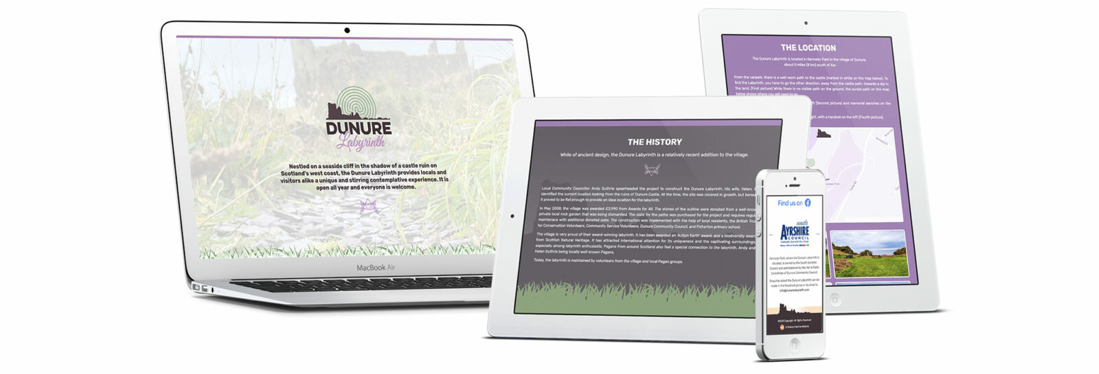
Once we established the branding and logo, we browsed through all of the information we could find about the labyrinth and the people who built it. From there, we designed the website around this information and took a few photos and created some wayfinding graphics to help guide people to the site.
We claimed the Google Business listing for Dunure Labyrinth as well so that we could ensure the information contained on Google Maps remains up-to-date and upcoming events related to the labyrinth are visible for everyone, whether they’re visiting the website or the area on Google Maps.

Check out our work for yourself to learn more about Dunure Labyrinth.